How your product looks, and feels is essential to attract attention of shoppers. There are two aspects you always need to have in mind when designing your product:
- Design portraying RELEVANT message, so that it can be considered by shoppers in the first place
- Design being UNIQUE to stick out of that consideration set of products and being chosen over others.
None of the above is easy to accomplish in the world of millions of products across numerous categories. We are sure that designers and creative people will find a way to understand what relevance and uniqueness means and translate this into successful product design. We are here to stress one thing that could help: SIMPLICITY!
No matter how creative your design agency is, they will always put simplicity at the end of their considerations. Afterall, they are artists, and they strive to show that in product design solutions. But shelves of the stores and web pages are asking them to develop one more skill – get the relevant message into consumer minds FAST!

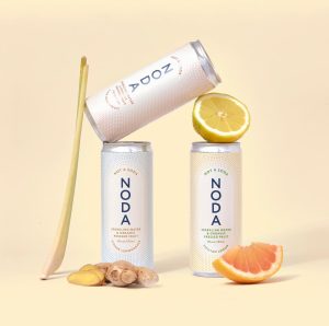
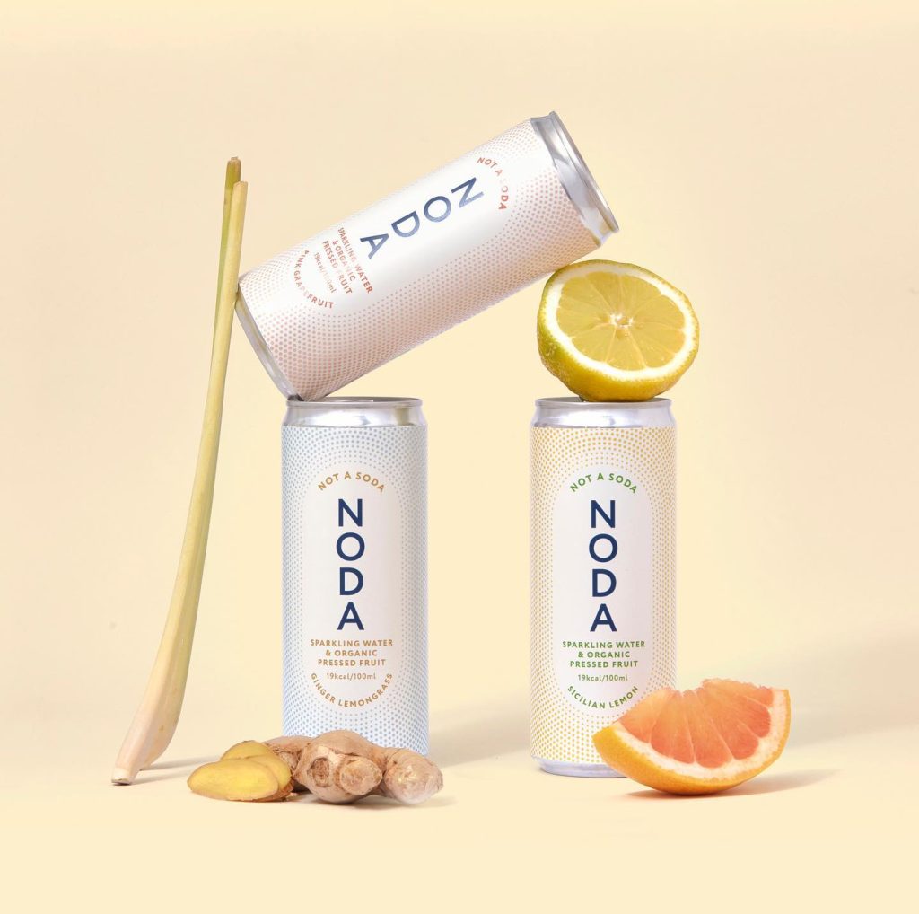
We are bringing you an interesting case of pack design here that could trigger your minds in thinking about your next move in product design. Introducing NODA.
It is a mainstream soft drink launched in Denmark. As they say, they are easy, organic, and low-calorie drink. And we all agree that this is relevant, but then how do we manage to say all of this in a sentence easy to be read in less than 7 seconds that our shoppers have on average before they decide to consider this as a thirst-quenching solution.
The simple name that tells exactly what this product is NOT, is the key. It builds attention and everything else is well understood through simple, calm colors and clean look and feel.
The message “NOT A SODA” is definitely important for those trying to cut on calories from regular carbonated soft drinks and are looking for something that is more promising than just a soda with no sugar.
Looks interesting? Let`s talk.